- UI Wordpress
-
 March 17, 2026
 -
 Vinay Sahu
 -
 Reading time: 7 minute(s)
Table Of Content
- Too Long or Too Short Page Length
- Too Much Text Without Images & Videos
- Lack of Clear and Well Managed Navigation
- Confusing User Interface in design mistakes
- Confusing Visual Hierarchy of Sections
- Having Too Many Calls to Action & Buttons
- Inappropriate Fonts or Colors
- Lack of Dynamic Animations
- Conclusion
- FAQs
There are a lot of things to consider when designing a website. From the layout to the fonts and colors, every decision you make can have an impact on your site's user experience. This is especially true if you're new to designing websites.The stakes are high, so it's important that you get it right. But what happens if you make a website design mistake? Nobody's perfect, and there are always going to be pitfalls along the way. Here are some common design mistakes people make with website design and advice for fixing them. The optimal page length is dependent on the type of content you are looking to present. A book can be hundreds of pages long, while a blog post may only be a few hundred words. The design should match the content. When designing your website, you should consider the type of user that will be viewing it. If your site is geared towards children, you don't want to overwhelm them with too much text or information on each page.If you're creating a website for an older audience, it's more appropriate to have more content on each page.It's not enough for people to see your content. If you want them to read it, you need even more than just a clever headline or catchy image – You have to put in some effort and allow the reader into your story as best they can without coming off abrasive. In other words, if someone is reading something that takes time out of their day, be sure they know that they'll get at least an equivalent reward from it - whether that means humor or knowledge -- but don't leave them feeling disappointed because now all the time spent reading was wasted!
 One of the most important areas to focus on when designing a website is the navigation. Navigation helps your site's visitors find their way around and figure out where they are.Navigation should be clear and well-managed in order to avoid confusion. Visitors will become frustrated if they can't find what they're looking for. To avoid this, make sure your site's navigation is arranged in a logical way. When users visit your site, they should be able to find what they want within five clicks or less.You may also consider offering two types of navigation options: one for visitors who know exactly what they're looking for and another for those who are less familiar with your site's content or services. This will make navigation easier for everyone.
 One of the most common mistakes people make with website design is confusing their site's user interface.This is a particularly easy mistake to make if you don't have experience in design. A confusing user interface can be frustrating, and it's been known to lead to high bounce rates and poor conversion rates. Here are some ways you can fix this problem: -Keep your layout clear and simple. Make sure users know where they are at all times, what actions they can take, and where they need to go next.-Limit the number of items on a page so that users know what content is important, which items they need to interact with, and which ones they can ignore. -Use text rather than graphics as much as possible. Graphics should only be used when necessary for branding or other purposes related to clarity. Images should not be used for important information or navigation options.
 One of the most common mistakes people make with website design is confusing the visual hierarchy of sections. If your site is too busy and has too many different sections fighting for attention, it can be difficult to find what you're looking for.For example, if you have a "Shop" section in one spot and a "Contact Us" section in another, it's very easy for your visitors to get confused about which section they should go to first. They may begin exploring your site by clicking on the "Contact Us" button because they don't know if they should go to the "Shop" section or not.Fix this problem by focusing on your visitor's experience. As you're designing, ask yourself questions like: "Do I want my visitor to click here?" and "Is this link important?" You'll need to make some tough decisions as you go along and prioritize certain sections over others, but it will be worth it once your site is finished.Inappropriate fonts and colors are a common mistake people make when designing websites. Sometimes these choices are unintentional, but they can have a big impact on the feeling of your site. Colors can be too bright or dull and fonts might be difficult to read or too fancy. There are two main ways to fix this problem: you can change your color scheme to something more appropriate, or you can update your existing content with a new font and color scheme that is more suitable for your brand. You could also add in different visual elements on the page that help soften the harshness of the colors or fonts on the page.
 You've probably seen videos of websites that dynamically animate. They seem to come to life, and the visuals constantly update in a way that's engaging. Creating animations and adding them to your website can help set you apart from other websites, as well as make your site more responsive to visitors' needs.There’s no doubt that a well-website design can have a huge impact on the success of your business. But even the most expertly designed sites can have flaws. You’ll want to make sure you avoid these 10 common. design mistakes to ensure your website is a success.If you’re looking for help with any of these common website design mistakes, don’t hesitate to reach out! We would love to help you out.
Too Long or Too Short Page Length
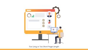 The optimal page length is dependent on the type of content you are looking to present. A book can be hundreds of pages long, while a blog post may only be a few hundred words. The design should match the content. When designing your website, you should consider the type of user that will be viewing it. If your site is geared towards children, you don't want to overwhelm them with too much text or information on each page.If you're creating a website for an older audience, it's more appropriate to have more content on each page.
Too Much Text Without Images & Videos
 It's not enough for people to see your content. If you want them to read it, you need even more than just a clever headline or catchy image – You have to put in some effort and allow the reader into your story as best they can without coming off abrasive. In other words, if someone is reading something that takes time out of their day, be sure they know that they'll get at least an equivalent reward from it - whether that means humor or knowledge -- but don't leave them feeling disappointed because now all the time spent reading was wasted!
Lack of Clear and Well Managed Navigation
 One of the most important areas to focus on when designing a website is the navigation. Navigation helps your site's visitors find their way around and figure out where they are.Navigation should be clear and well-managed in order to avoid confusion. Visitors will become frustrated if they can't find what they're looking for. To avoid this, make sure your site's navigation is arranged in a logical way. When users visit your site, they should be able to find what they want within five clicks or less.You may also consider offering two types of navigation options: one for visitors who know exactly what they're looking for and another for those who are less familiar with your site's content or services. This will make navigation easier for everyone.
Confusing User Interface in design mistakes
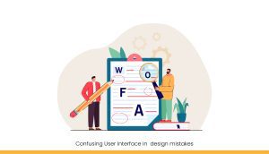 One of the most common mistakes people make with website design is confusing their site's user interface.This is a particularly easy mistake to make if you don't have experience in design. A confusing user interface can be frustrating, and it's been known to lead to high bounce rates and poor conversion rates. Here are some ways you can fix this problem: -Keep your layout clear and simple. Make sure users know where they are at all times, what actions they can take, and where they need to go next.-Limit the number of items on a page so that users know what content is important, which items they need to interact with, and which ones they can ignore. -Use text rather than graphics as much as possible. Graphics should only be used when necessary for branding or other purposes related to clarity. Images should not be used for important information or navigation options.
Confusing Visual Hierarchy of Sections
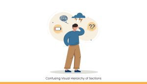 One of the most common mistakes people make with website design is confusing the visual hierarchy of sections. If your site is too busy and has too many different sections fighting for attention, it can be difficult to find what you're looking for.For example, if you have a "Shop" section in one spot and a "Contact Us" section in another, it's very easy for your visitors to get confused about which section they should go to first. They may begin exploring your site by clicking on the "Contact Us" button because they don't know if they should go to the "Shop" section or not.Fix this problem by focusing on your visitor's experience. As you're designing, ask yourself questions like: "Do I want my visitor to click here?" and "Is this link important?" You'll need to make some tough decisions as you go along and prioritize certain sections over others, but it will be worth it once your site is finished.
Having Too Many Calls to Action & Buttons
One of the most common mistakes in website design is confusing visitors by having too many calls to action and buttons. You want your visitors to be able to find what they're looking for quickly, but if you have too many options, they'll get confused. For example: If a visitor clicks on an advert at the top of your web page that says "Buy Now" with no other information about it or where this link will take them, there's little chance that user will click through because (1) They don't know why clicking this button would help them achieve their goal; and (2) The site doesn't seem intuitive enough for people who are just browsing aroundInappropriate Fonts or Colors
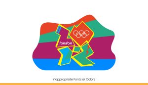 Inappropriate fonts and colors are a common mistake people make when designing websites. Sometimes these choices are unintentional, but they can have a big impact on the feeling of your site. Colors can be too bright or dull and fonts might be difficult to read or too fancy. There are two main ways to fix this problem: you can change your color scheme to something more appropriate, or you can update your existing content with a new font and color scheme that is more suitable for your brand. You could also add in different visual elements on the page that help soften the harshness of the colors or fonts on the page.
Lack of Dynamic Animations
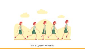 You've probably seen videos of websites that dynamically animate. They seem to come to life, and the visuals constantly update in a way that's engaging. Creating animations and adding them to your website can help set you apart from other websites, as well as make your site more responsive to visitors' needs.
Conclusion
 There’s no doubt that a well-website design can have a huge impact on the success of your business. But even the most expertly designed sites can have flaws. You’ll want to make sure you avoid these 10 common. design mistakes to ensure your website is a success.If you’re looking for help with any of these common website design mistakes, don’t hesitate to reach out! We would love to help you out.
FAQs
Q1. What are the most common website design mistakes?
Common mistakes include poor navigation, confusing layout, lack of visual hierarchy, too much text without images, and inappropriate font or color choices.Q2. How does poor navigation affect user experience?
If visitors can’t find what they need within a few clicks, they may leave the site quickly. Clear menus and logical navigation improve user satisfaction and reduce bounce rates.Q3. Why is visual hierarchy important in website design?
Visual hierarchy guides users through your content in a logical way. Without it, users may get confused about where to focus or what actions to take next.Q4. How can too many buttons or CTAs hurt my website?
Excessive CTAs overwhelm users and reduce clarity. Stick to one primary call-to-action per page to keep your visitors focused and drive better conversions.Q5. Can using the wrong fonts or colors harm my website?
Yes. Hard-to-read fonts and jarring color schemes can turn users away. Always use legible fonts and color combinations that align with your brand and improve readability.The world’s First zero commission platform
Hire tech partners effortlessly
 If you're a non-tech founder looking for an agency or a tech founder looking for engineers.
 You can get your 5 best matches from 2800 in 5 mins, with 1000 data points tracked.
 Connect directly with no credit card needed!
You’re just a click away from the best talent.
About the author