- UI
-
 July 10, 2025
 -
 Vinay Sahu
 -
 Reading time: 7 minute(s)
A website color scheme is the set of colors that are used in a design to create a certain mood or effect. The color scheme chosen for your website will have a major impact on how your brand is perceived by visitors. It's important to choose the right one so that it doesn't clash with your color palette, as well as reflect the tone you're trying to convey. It can be difficult to know what colors are best for your company, especially because there are so many variables to consider when creating one. In this article, you'll learn about the basics of color schemes, and how they affect our moods and perceptions. You'll also find tips from experts in designing websites about what makes a good color scheme, and some examples of common applications for each type of scheme - monochromatic, analogic, triadic, complementary, etc. SchemesA color scheme is the set of colors that are used in a design to create a certain mood or effect. The color scheme chosen for your website will have a major impact on how your brand is perceived by visitors. It's important to choose the right one so that it doesn't clash with your color palette, as well as reflect the tone you're trying to convey.There are many variables when choosing the right color scheme for your company. Some people prefer a monochromatic or analogic color scheme, while others may prefer triadic or complementary schemes. There’s no best type of color scheme, but there are some things to consider when deciding which one to use on your website. These include:-The mood you want to convey -The colors of the products and services you offer -The number of colors you want to use -Your target audience and their preferences
 Color schemes can evoke a variety of moods and effects. But not all color schemes are made equal - some have more impact than others. The type of effect you intend to create when choosing your color scheme also plays an important role in the colors you choose. Understanding how a color scheme can affect our moods and perceptions is key in choosing the right one for your website. For example, warm colors often inspire feelings of comfort or relaxation, while cool colors feel fresh or modern. Analogic colors - that is, those that share three common hues - look natural and cohesive, while complementary colors stand out against each other for a striking effect. If you're looking for high visibility on social media, then monochromatic colors may be best for you. See below for some tips from experts in designing websites about what makes a good color scheme: - Monochromatic: One hue with varying shades- Analogic: Colors that share three common hues- Triadic: Colors that share three common hues with an additional third color- Complementary (trigonal): Colors opposite each other on the spectrum
 The colors you choose for your website's color scheme should reflect your brand's personality, values, and goals. You should also consider the meaning of your chosen colors. For example, if you're a company that wants to be seen as youthful and hip, then you might opt for a bright, bold color scheme; while if you're trying to evoke a sense of elegance and prestige, then you may want to use more muted tones. Additionally, the meanings behind a color can change depending on the culture, context, or symbolism associated with it. For instance, "red" is often associated with danger in Western culture (think about stop signs), but it represents luck in China. It's important to know how these cultural associations can affect how your audience perceives your company - so make sure that the colors you choose are consistent with what you're trying to achieve.
 What tone are you trying to convey with your website? Are you trying to create a relaxing atmosphere, or a more active one? Are you looking for colors that will appear classic and traditional, or colors that are more modern? These decisions should be made before choosing your color scheme.You want to consider the tone of your company and see how these colors would match that. For example, if you're in an industry like healthcare and you want visitors to feel calm and relaxed when they visit your website, the best choice is a monochromatic color scheme. If you're in an industry such as technology, colors with less saturation might work better since those types of colors tend to have a more contemporary appeal. If you're still not sure what type of color scheme is best for your company's needs, it can be helpful to take inspiration from other companies in similar industries. You can also search sites like Pinterest to learn about different color schemes that people have been using for their websites over time.
The Basics of website Color schemes
 SchemesA color scheme is the set of colors that are used in a design to create a certain mood or effect. The color scheme chosen for your website will have a major impact on how your brand is perceived by visitors. It's important to choose the right one so that it doesn't clash with your color palette, as well as reflect the tone you're trying to convey.There are many variables when choosing the right color scheme for your company. Some people prefer a monochromatic or analogic color scheme, while others may prefer triadic or complementary schemes. There’s no best type of color scheme, but there are some things to consider when deciding which one to use on your website. These include:-The mood you want to convey -The colors of the products and services you offer -The number of colors you want to use -Your target audience and their preferences
How website Color Schemes Affect Our Moods and Perceptions
 Color schemes can evoke a variety of moods and effects. But not all color schemes are made equal - some have more impact than others. The type of effect you intend to create when choosing your color scheme also plays an important role in the colors you choose. Understanding how a color scheme can affect our moods and perceptions is key in choosing the right one for your website. For example, warm colors often inspire feelings of comfort or relaxation, while cool colors feel fresh or modern. Analogic colors - that is, those that share three common hues - look natural and cohesive, while complementary colors stand out against each other for a striking effect. If you're looking for high visibility on social media, then monochromatic colors may be best for you. See below for some tips from experts in designing websites about what makes a good color scheme: - Monochromatic: One hue with varying shades- Analogic: Colors that share three common hues- Triadic: Colors that share three common hues with an additional third color- Complementary (trigonal): Colors opposite each other on the spectrum
Tips for Creating a Good Color Scheme

- Choose colors that work well together : Before you choose a color scheme, you should look at how the colors work together. The key is to find colors that are harmonious with each other and create the desired effect. You might even try using the color wheel to see what colors would go best together.
- Consider the psychology of color : There are many different types of color schemes and moods they convey. You should take some time to decide what mood you want your website's design to have and then pick a set of colors accordingly. For example, if you want your site to come across as happy and fun, you'll want a bright, upbeat color scheme like yellow or pink with orange tones. If you want your website's design to be sleek and sophisticated, you may opt for blues or grayscale images instead.
- Keep up with trends in web design : It's important to stay on top of current trends in web design so that your site is easy for people to navigate and aesthetically pleasing to look at - which will encourage them to stick around for longer periods of time and engage with your content more deeply! The best way to do this is by keeping up with industry professionals who are designing websites for a living. They'll be able to point out new trends in color schemes as they arise and will help guide you towards making an informed decision about which one is most appropriate for your company.
Consider the Meaning of Your Colors
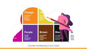 The colors you choose for your website's color scheme should reflect your brand's personality, values, and goals. You should also consider the meaning of your chosen colors. For example, if you're a company that wants to be seen as youthful and hip, then you might opt for a bright, bold color scheme; while if you're trying to evoke a sense of elegance and prestige, then you may want to use more muted tones. Additionally, the meanings behind a color can change depending on the culture, context, or symbolism associated with it. For instance, "red" is often associated with danger in Western culture (think about stop signs), but it represents luck in China. It's important to know how these cultural associations can affect how your audience perceives your company - so make sure that the colors you choose are consistent with what you're trying to achieve.
Pick a Scheme That Reflects the Tone You're Trying to Convey
 What tone are you trying to convey with your website? Are you trying to create a relaxing atmosphere, or a more active one? Are you looking for colors that will appear classic and traditional, or colors that are more modern? These decisions should be made before choosing your color scheme.You want to consider the tone of your company and see how these colors would match that. For example, if you're in an industry like healthcare and you want visitors to feel calm and relaxed when they visit your website, the best choice is a monochromatic color scheme. If you're in an industry such as technology, colors with less saturation might work better since those types of colors tend to have a more contemporary appeal. If you're still not sure what type of color scheme is best for your company's needs, it can be helpful to take inspiration from other companies in similar industries. You can also search sites like Pinterest to learn about different color schemes that people have been using for their websites over time.
Examples of Common website Color Schemes.

Conclusion
Choosing a color your website is more complicated than you might think.The colors on your site can evoke different moods, so it's important to have a color that will represent the tone you're trying to convey to your visitors.It's worth noting that a lot of web designers use color schemes that are basic, but there are a lot of creative ways to incorporate color into your website and make it stand out.The key is to understand the basics of color theory, while also considering the meaning of the colors you're choosing. A good rule of thumb is to pick a color scheme that reflects the tone you're trying to convey.The world’s First zero commission platform
Hire tech partners effortlessly
 If you're a non-tech founder looking for an agency or a tech founder looking for engineers.
 You can get your 5 best matches from 2800 in 5 mins, with 1000 data points tracked.
 Connect directly with no credit card needed!
You’re just a click away from the best talent.
About the author