- UI Colors UI User Interface
-
 March 18, 2026
 -
 Vinay Sahu
 -
 Reading time: 5 minute(s)
Like anything else, color needs to be used in moderation. You will be inclined to achieve a good outcome if you stick to Max three primary colors in your color scheme. Putting colors to a design project has a lot to do with opportunity and the more you use colors the more complicated it’s to attain balance.Colour does not add a good quality to UI design — it reinforces it. If you want extra colors beyond those you’ve defined, make use of shades that will give you dissimilar tones that you can work with. The meaning of colors in UI design can differ depending on culture and situation. colors are creators of feelings and association
 Playing with colors and tones early in your UI designs can betray you quickly because before you know, you have spent 2 hours moving primary colors. It might be annoying to learn how to avoid these playing with colors.The best thing you could do is to pay attention to spacing and laying out the element. This will save time. Make use of dissimilar tones if you want it to look attractive.
 The essential color tricks are to stay away from using grey colors without saturation. Always remember to add a little saturation to your color. Unconsciously it will look more natural and intimate the users up.Believe in nature is the best color combination. The most important thing is looking into the surrounding for design solutions is that the color is always changing. To get inspired we must look around to get the best UI design that will suit our purpose.
 Some colors match well with each other, while some don’t. There are conclusive rules for how they will interact that can be noticed on a color wheel. You should know about these techniques but it’s not essential to do it physically.
 When we are discussing the UI design reference then dribbling is a good place for it. Additionally, different tools can be used for searching for colors
Tools
To make it simpler, the best tools for selecting color are available in 2019. They will save a lot of your time.
When we are discussing the UI design reference then dribbling is a good place for it. Additionally, different tools can be used for searching for colors
Tools
To make it simpler, the best tools for selecting color are available in 2019. They will save a lot of your time. You can easily lock the selected color and press space to create a palette. Colors give access to upload an image and create a color palette from it. The cool thing about it is you are not restricted to only one probability but instead you have a picker that makes you modify reference point.This tool is available in the browser, and also in the desktop version. If you are using a desktop version, it is easier for you to export a color strategy into Photoshop.It is related to Kuler but the difference is that you are not restricted from only 5 tones. Paletton is a great tool when you have the primary colors and you want to play with multiple tones
 Think about knowing your color palette but you want to see examples of fine the mix. Designspiration is a great tool for this. You can select 5 colors and find the images that can compare your query. It is not only for search images with specific colors but is also real execution of them in UI design.
 The Shutterstock has a tool that is called spectrum where you can find photos by a particular tone. You don’t need to subscribe because you can use a small preview with a watermark to create a palette.
 Tineye can help you if you need a mix of colors in the photo and identify the quantity of each one. The website uses a database of 10 million creative usual images from Flickr.
 The color is a difficult concept to memorize, most especially in the digital era. The tips listed above can ease the job of searching the right colors. The best idea to learn is to make a stunning color strategy and make practice by playing with the colors.
Color meaning in UI design
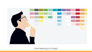 The meaning of colors in UI design can differ depending on culture and situation. colors are creators of feelings and association
- Red: Passion, Love, Danger, excitement, energy
- Blue: Calm, Responsible, Safe, depressed, communicating
- Black: Mystery, Elegance, Evil, sophisticated, formal
- White: Purity, Silence, Cleanliness, innocence, simplicity
- Green: New, Fresh, Nature, prestige, vitality
- If you want more check this list — color culture.
Grayscale first
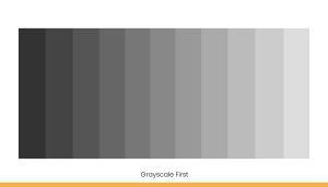 Playing with colors and tones early in your UI designs can betray you quickly because before you know, you have spent 2 hours moving primary colors. It might be annoying to learn how to avoid these playing with colors.The best thing you could do is to pay attention to spacing and laying out the element. This will save time. Make use of dissimilar tones if you want it to look attractive.
Stay away from pure grayscale and black
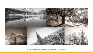 The essential color tricks are to stay away from using grey colors without saturation. Always remember to add a little saturation to your color. Unconsciously it will look more natural and intimate the users up.Believe in nature is the best color combination. The most important thing is looking into the surrounding for design solutions is that the color is always changing. To get inspired we must look around to get the best UI design that will suit our purpose.
Keep the contrast
 Some colors match well with each other, while some don’t. There are conclusive rules for how they will interact that can be noticed on a color wheel. You should know about these techniques but it’s not essential to do it physically.
Get inspired
 When we are discussing the UI design reference then dribbling is a good place for it. Additionally, different tools can be used for searching for colors
Tools
To make it simpler, the best tools for selecting color are available in 2019. They will save a lot of your time.
When we are discussing the UI design reference then dribbling is a good place for it. Additionally, different tools can be used for searching for colors
Tools
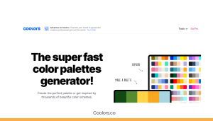
To make it simpler, the best tools for selecting color are available in 2019. They will save a lot of your time..Coolors.com
 You can easily lock the selected color and press space to create a palette. Colors give access to upload an image and create a color palette from it. The cool thing about it is you are not restricted to only one probability but instead you have a picker that makes you modify reference point.
⦁ Kuler
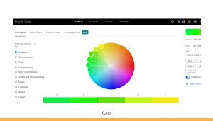 This tool is available in the browser, and also in the desktop version. If you are using a desktop version, it is easier for you to export a color strategy into Photoshop.
⦁ Paletton
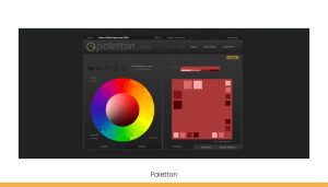 It is related to Kuler but the difference is that you are not restricted from only 5 tones. Paletton is a great tool when you have the primary colors and you want to play with multiple tones
⦁ Designspiration.net
 Think about knowing your color palette but you want to see examples of fine the mix. Designspiration is a great tool for this. You can select 5 colors and find the images that can compare your query. It is not only for search images with specific colors but is also real execution of them in UI design.
⦁ Shutterstock lab spectrum
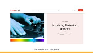 The Shutterstock has a tool that is called spectrum where you can find photos by a particular tone. You don’t need to subscribe because you can use a small preview with a watermark to create a palette.
Tineye Multicolor
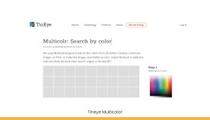 Tineye can help you if you need a mix of colors in the photo and identify the quantity of each one. The website uses a database of 10 million creative usual images from Flickr.
Final thoughts
 The color is a difficult concept to memorize, most especially in the digital era. The tips listed above can ease the job of searching the right colors. The best idea to learn is to make a stunning color strategy and make practice by playing with the colors.
FAQs
Q1. Why is it recommended to use only 2–3 colors in UI design?
Using a limited color palette helps maintain visual balance, improves readability, and ensures a clean, cohesive user experience without overwhelming the viewer.Q2. What is the importance of color meaning in UI design?
Colors evoke emotions and perceptions. For example, red signals urgency, while blue suggests trust. Understanding color psychology helps designers create user-friendly and impactful interfaces.Q3. Should I design in grayscale first?
Yes, starting with grayscale helps focus on layout and spacing before adding colors, avoiding distractions and saving design time in the early stages.Q4. Why should pure black and unsaturated gray be avoided?
They can make the design look flat or harsh. Slightly saturated shades feel warmer and more natural, enhancing the overall user experience.Q5. Which tools are best for choosing UI color palettes?
Top tools include Coolors, Adobe Kuler, Paletton, Designspiration, and Shutterstock Spectrum—they simplify color selection and palette creation for digital projects.The world’s First zero commission platform
Hire tech partners effortlessly
 If you're a non-tech founder looking for an agency or a tech founder looking for engineers.
 You can get your 5 best matches from 2800 in 5 mins, with 1000 data points tracked.
 Connect directly with no credit card needed!
You’re just a click away from the best talent.
About the author